VIEW BY CATEGORY:
Hi, we're Hunter and Sarah, a husband-and-wife, luxury wedding photography team. We’re also educators, helping other photographers build profitable and sustainable photography businesses.
MEET US
LOOKING FOR SOMETHING?
Best Instagram Grid: Common Instagram Mistakes for New Photographers Part 3
April 4, 2024
“How can I have the best Instagram grid for my photography business?” is a really important question! We can get so caught up in each individual Instagram post that we can forget to take a step back, and look at the grid as a whole! So today, we’re discussion our third common Instagram mistake: failing to be intentional with your grid.
The tl;dr of this blog is that — as in all things — a little intentionality and a bit of planning can go a long way! Instagram is ultimately a way for people who are interested in you and your photography to get a quick introduction to you, your work, and your brand. But what will they see when they tap onto your profile? Will they see the best Instagram grid they’ve ever seen? Or a mess of random images that seem loosely related? Because the answer to that question may determine whether or not they DM you or click over to your website!
A Good Instagram Grid Is Your Second (Or First) Homepage
If you don’t have a website yet, your Instagram is literally your homepage. It’s the first place that people will go when they search for you or find you from someone else’s tag. And their first impression is NOT your most recent photo, but your grid. That’s right! At any given moment, the most recent 12 images (together as a group) form the first impression of your business. So it’s critical that you have the best Instagram grid possible at any given time!
Many of us do have a website that serves as a true “homepage” for our photography business. But we know from experience that many couples who hear about us from a friend, or discover us from someone else’s Instagram post, will view our Instagram profile first. They’ll do that before they decide whether or not to click the link in our bio and head to our actual website!
2017 Grid… Vs 2024 Grid
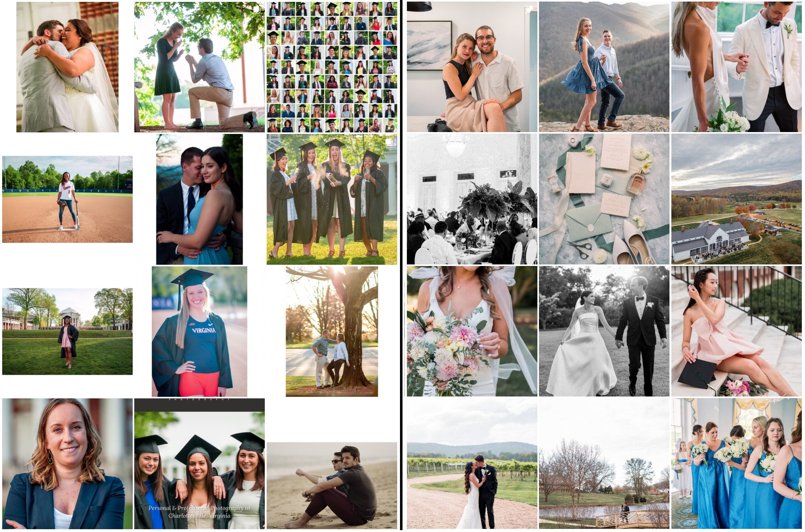
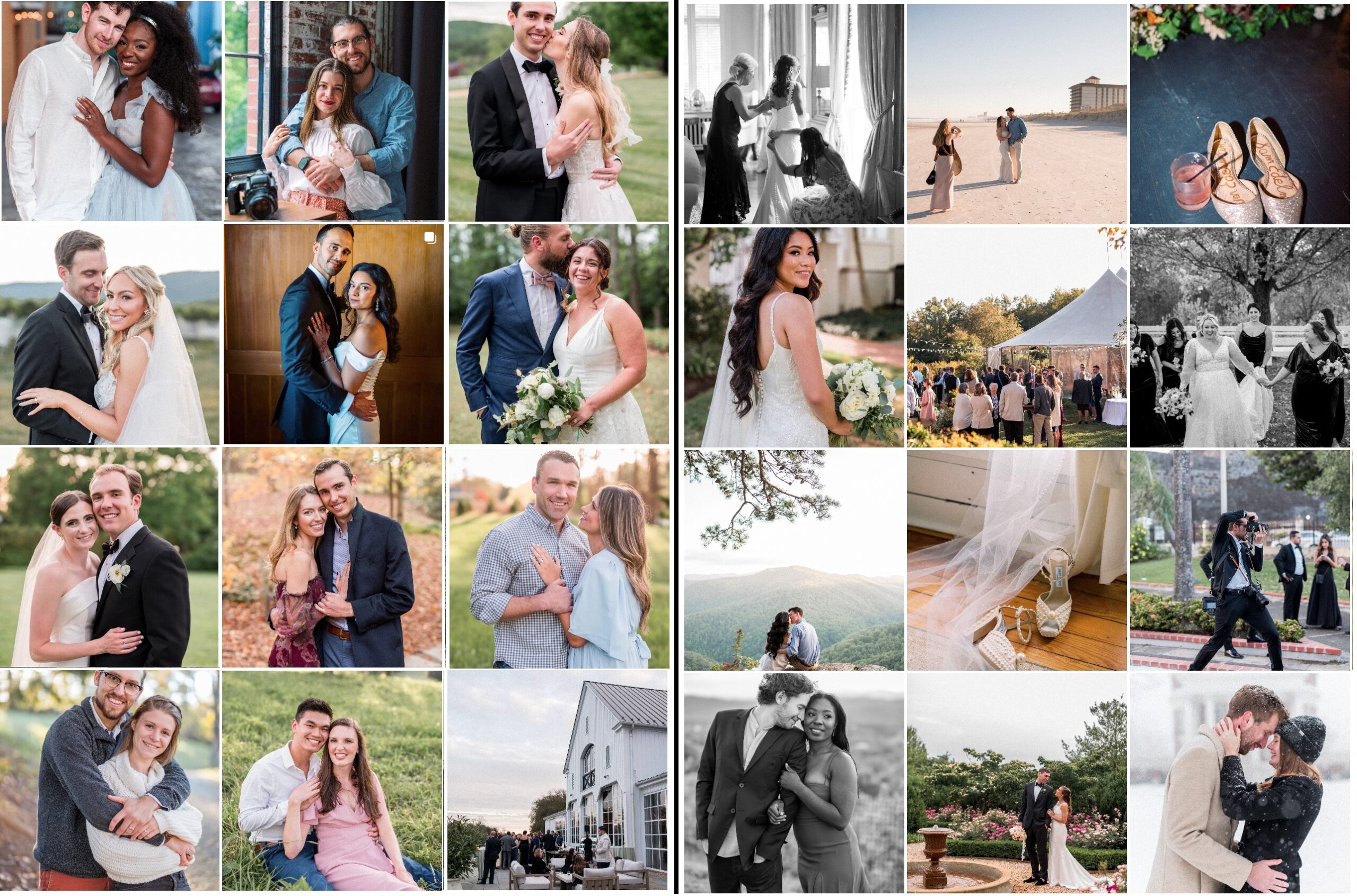
Trust us, when we first started our Instagram account, it was pretty bad 😂 We’ve come a long way — and we still aren’t perfect! The three columns you see on the left are a screenshot of our Instagram grid from the summer of 2017, just a few months after we first started an Instagram account for our young photography business. The grid you see on the right is a screenshot of our current Instagram grid, in April of 2024. We’ve come a long way in 7 years!
What Do You Need?
Since your Instagram grid is such an important first impression, you want to be SO intentional about what you’re posting! Of course, this is coming from two photographers who are human and don’t always do this perfectly.
But before we schedule our posts for the week, the first thing we do is check our current Instagram grid. Then, we decide what the grid needs or doesn’t need. Maybe we’ve been posting a lot of tight-crops lately, so we “need” a wide image. Or maybe we haven’t posted an engagement photo in a while, so that’s what our grid “needs”. We always want to make sure that this “second homepage” looks as clean and polished as the main page on our website!
Content is Most Important… But Cohesiveness Is a Close Second
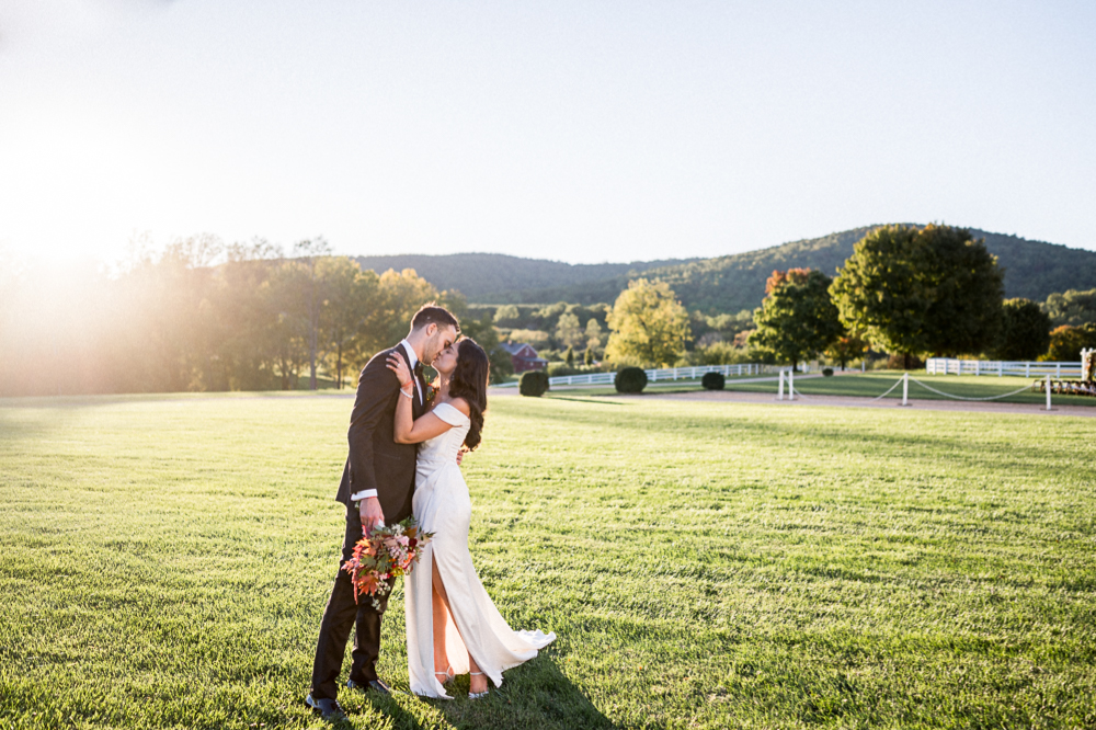
Although varying what you post is critical (see Mistake #2), the order that you’re posting your images is almost just as important in order to achieve your best Instagram grid! Not only should you vary what you post in terms of content. But visually, each image should look different from the next. If you post a client photo from your most recent session, then a personal photo of you and your partner, then a blog announcement, then another photo from another recent session, you’ve successfully avoided Mistake #2.
However, if all the images are tight-cropped, color photos of a couple, with their bodies facing each other and one person looking at the camera, your grid will look really strange and unattractive! And despite varied content, it will look dull and repetitive. Be sure you’re not only alternating content, but also composure. Mix tight-cropped images with wide shots. Throw in portrait-orientation with landscape-orientation. Vary black and white with color. Shake up camera-aware with candid (or “candid”). Add movement-based photos to ones with static posing. You get the idea!
Too-Similar Grid… vs Properly-Varied Grid
While the grid on the left and the grid on the right are both full of strong images, you can see right away which one is more dynamic and interesting! If I found the photographer on the left, I’d wonder if they only knew how to shoot one kind of photo! (I had to scroll through more than a year’s worth of posts to find 12 images with such similar composure.) Meanwhile, the grid on the right is just a screenshot of our Instagram from earlier in 2024.
Best Instagram Grid Tip: Show What You Want to Shoot
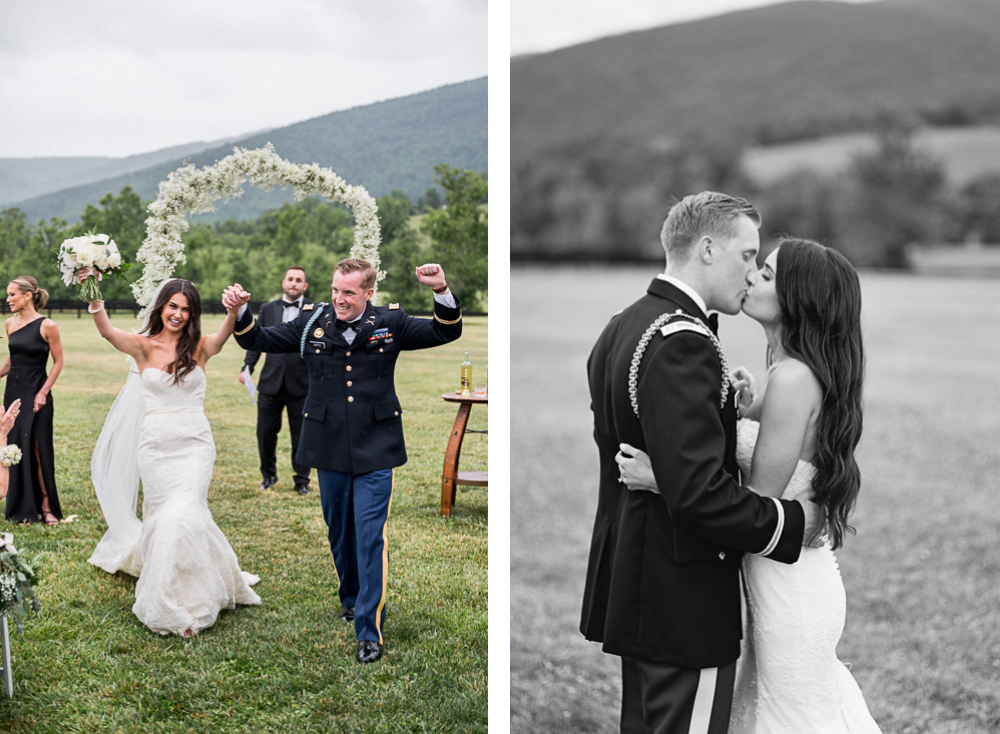
This is one of the most important principles of your Instagram grid. This is also the principle that we are constantly, constantly, CONSTANTLY hounding our photography students! When you post professional photos of your own work on your Instagram, the goal is for it to mirror what you want to shoot in real life.
In other words, if you want to shoot 75% weddings and 25% engagement sessions, your grid should be mostly weddings with a few engagement sessions mixed in. If you want to shoot 50% high school seniors and 50% newborn sessions, your grid should be half seniors and half newborn babies. (Other than personal and behind-the-scenes photos, of course.) It should go without saying that if you want to shoot couples, but all you post on your Instagram is family sessions, you’re going to book a lot more family sessions!
How to Slowly Transition To Your Best Instagram Grad
We remember how challenging this was early on. We wanted so badly to shoot more weddings, but needing the money so we photographed anything that paid. And if that’s you right now, that’s okay! We respect the hustle. But if you know that your ultimate goal is to be a wedding photographer, do everything in your power to fill your grid with couples. Overemphasize the couple sessions you do shoot, and don’t be afraid to let your families know that you’re transitioning away from family photography, so you won’t be posting their images publicly.
Does this sound like you? You’re photographing lots of things that you capture well and get paid for… but you don’t want to be shooting them. If so, slowly transitioning your Instagram grid away from that type of session will be a massive help in achieving your goals. It will take some time, so be patient, but don’t give up. You’re always just 12 posts away from a totally new grid!
Weddings, Engagements, Grads & Families Grid… vs Couples Only Grid
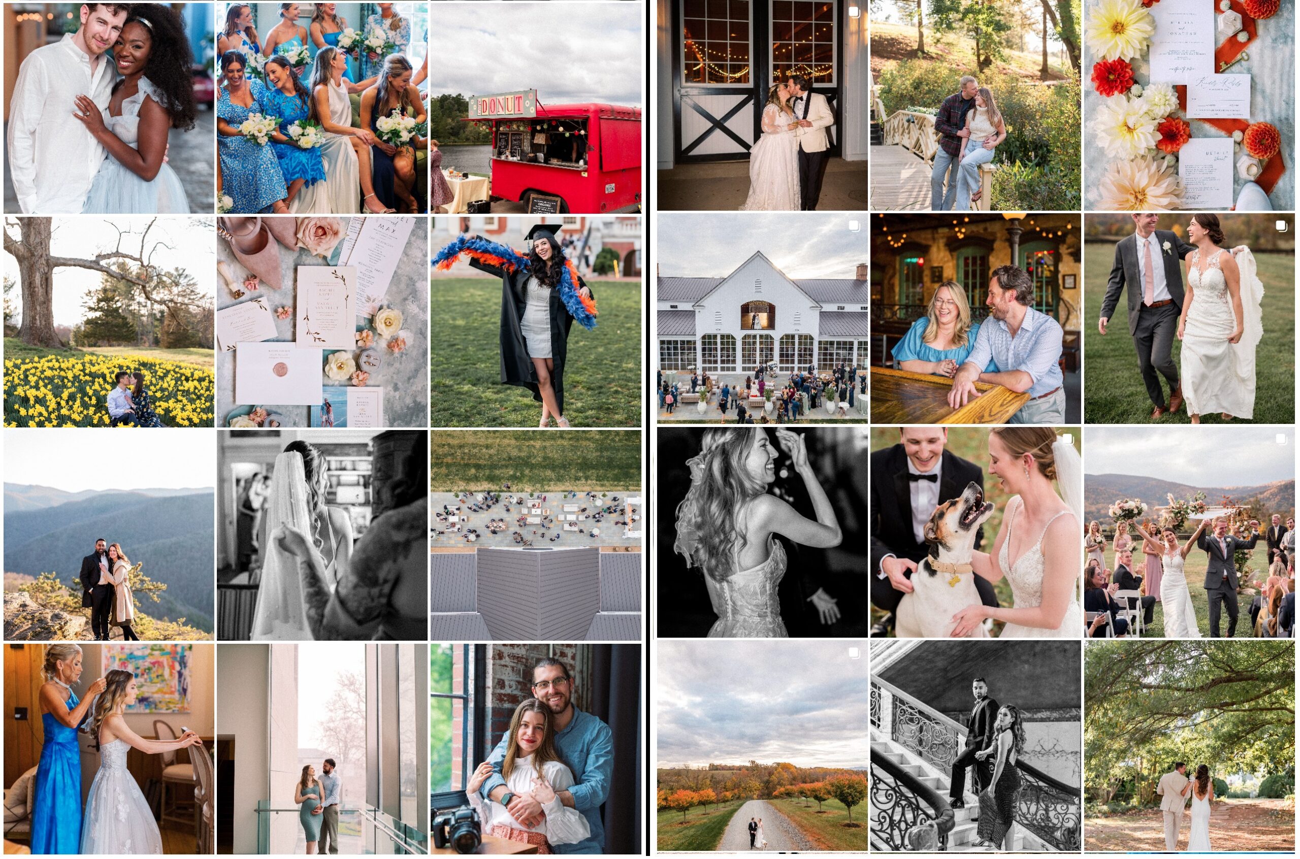
When we’re in our slower seasons, we’ll occasionally shoot family sessions for our past wedding couples. Plus we do lots of college grads each spring. So our grid from March of 2024 (on the left) reflects that with one image each, along with an image of us, 6 wedding images, and 3 engagement photos! However, if you look at our grid during a busy season — like the fall of 2023 — you’ll find something like the grid on the right. It was 9 wedding images and 3 engagement sessions, all of which had been photographed in the prior three weeks!
—
Check out the other segments in this blog series!
- Personal or Business Instagram: Common Instagram Mistakes for New Photographers Part 1
- What Should I Post to Instagram? Common Instagram Mistakes for New Photographers Part 2
- Best Instagram Grid: Common Instagram Mistakes for New Photographers Part 3
- Not Posting to Instagram Consistently: Common Instagram Mistakes for New Photographers Part 4
—
Want More?
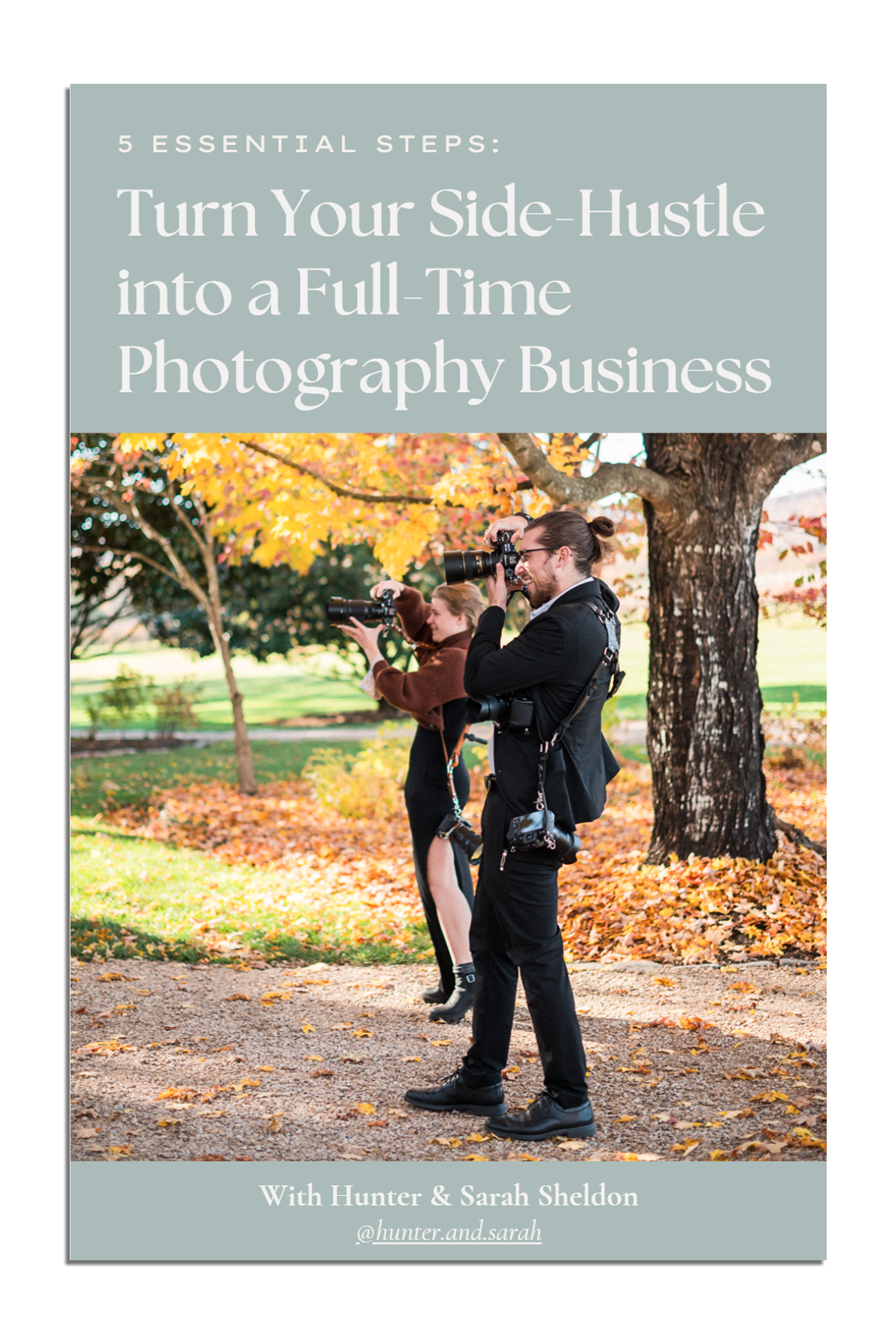
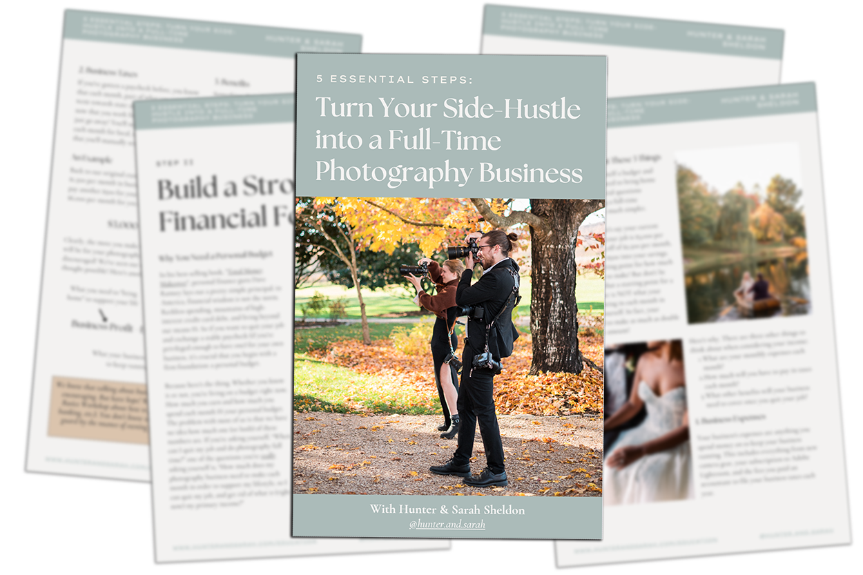
Click HERE to get your free copy of our eBook: “5 Essential Tips for Turning your Side-Hustle into a Full-Time Photography Business.” You’ll also be subscribed to our newsletter, so our newest content, weekly encouragement, and exclusive offers will be delivered right to your inbox!
Filed in:
Wedding Photography & Photography Education
Charlottesville, Virginia and Beyond
HOME
ABOUT US
WEDDINGS
JOURNAL
FOR PHOTOGRAPHERS
PRESS & PRAISE
BLOG
CONTACT
e. hunter@hunterandsarahphotography.com
p. (434) 260-0902
