VIEW BY CATEGORY:
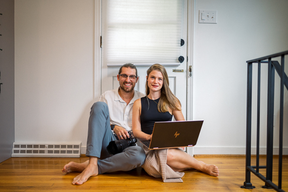
Hi, we're Hunter and Sarah, a husband-and-wife, luxury wedding photography team. We’re also educators, helping other photographers build profitable and sustainable photography businesses.
MEET US
LOOKING FOR SOMETHING?
Make this ONE Small Change to Your Website to Get More Photography Leads
July 27, 2023
Hey photographer friends! Welcome back to our Photography Blog, Mastering the Wedding Photography Biz with Hunter and Sarah! Today we’re sharing another simple website change that you can make in less than 10 minutes that could drastically improve the effectiveness of your photography website. So if you want more photography leads for your portrait or wedding business, then keep watching this video!
One Simple Change…
Now, in case you missed it, just a couple of nights ago, we hosted our most recent photography business workshop, called “Website Essentials”. It was all about building an effective website that actually converts website visitors into warm leads who are excited to contact you.
In that workshop, we spent the majority of our time teaching about how to build an effective customer journey that actually encourages your ideal clients to see and do what you want them to on your website. Then, at the end of the workshop, we shared the 7 most common mistakes that we see newer photographers making all the time. This one small change that we’re about to share with you was one of those frequent blunders. So here it is: one of the most common mistakes that we see new photographers make on their websites is not having a contact form at the bottom of every page.
How to Get More Photography Leads: LOTS of Contact Forms
As we shared in the workshop on Tuesday, building a customer journey is all about putting the right kind of information in front of your visitors so that — at the end of that journey — they’re eager to contact you.
But what if someone is half-way through this customer journey that you’ve built, and they’re convinced? The last thing you want is for them to be forced to continue on that journey once they’re ready to reach out to you! After all, they could get distracted or bored after that point, and never actually make it to the end of that journey where they send you an email. That’s the worst possible outcome!
That’s why, no matter how you’ve constructed your website or which pages you’ve included, we recommend to all our photography students that they have a contact form at the bottom of Every. Single. Page.
That way, even if someone is halfway through reading your “About Me” page or is in the middle of scrolling through your Portfolio, if they think to themselves, “Wow, I really like this person! I don’t need to see anything else. I’m convinced! What’s the next step?” BOOM. The form should be right there, ready for them to start typing. And we don’t mean there’s a link at the bottom of each page that will bring people to your contact page. Literally, embed the form right there on every page.
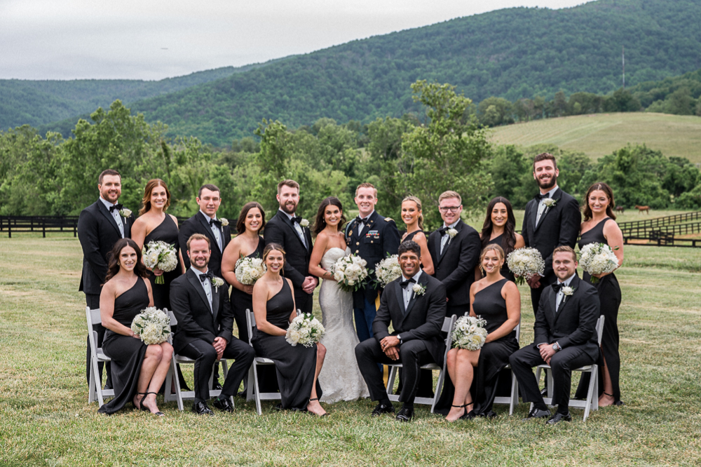
Best Contact Form for More Photography Leads
Now if you’re going to put a contact form on every single page of your website, you obviously want it to be a good one! So here’s a few more tips to get the most out of your contact form, which should lead to getting more photography leads. The first is to keep in mind that people have short attention spans, and are generally mistrustful of sharing any of their own information on the internet. So the shorter you make the form, the more likely someone is to complete it.
I’m sure you guys have been in a situation like this before, when you’re filling out an online feedback survey for some company. I don’t know about you guys, but if I’m giving up a few moments of my time to give helpful feedback to a company, that survey better be short. Because once I’ve clicked three of four times and there are still more questions, I’m liable to just give up and exit out of the survey. And you don’t want potential leads doing the same thing because you’ve asked them for way too much on your contact form!
A great example of this is asking your clients for their phone number or their social media handles. Are you actually going to use their number to call or text them? Are you going to go follow them on social media or DM them? If you will, then ask for that info! But if not, keep your contact form shorter by skipping those questions.
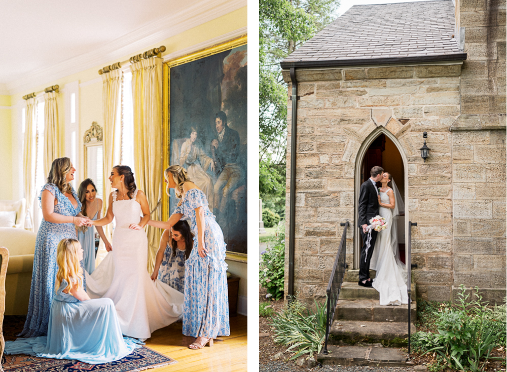
What to Ask for In a Good Photography Contact Form
But on the flip side, our second piece of advice is to be unashamed about asking for all the information you do actually need. The easiest contact form in the world would just ask for a name and email address. But you’d waste so much of your own time and your clients’ time emailing back and forth, asking the same questions over and over again. So ask for exactly the information you need!
If you’re photographing weddings, we recommend asking for date, location, and guest count — because those things will tell you a lot about what a wedding will be like. If you’re a portrait photographer, you can just ask if they have a specific date or location in mind, because oftentimes portrait clients know they want pretty photos, but that’s as far as they’ve gotten.
Now whether you’re a portrait photographer or a wedding photographer, asking for their expected photography budget and what they hope to have included in that budget also gives you an idea of whether or not this is a lead you respond to right away, or one you think about referring out to another photographer who charges less than you.
And finally, no matter what kind of contact form it is, make sure you ask for how they heard about you. This is the “lead source” and it’s a vital piece of data for your business. Lead source is your most important piece of feedback to let you know how all of your marketing efforts are working, and what’s actually getting people over to your website.
Want More Great Website Advice?
Now, we know that this one simple change is going to help you get more photography leads. But while small changes like these could yield 5% or 10% more leads, setting up your website with an effective customer journey could actually double or triple your leads.
And so if you want to learn more about what it means to set your website up not just so that it looks good, but so that it actually brings your visitors on a customer journey and gets you far more photography leads, then we’d encourage you to check out our workshop that we mentioned at the top of this post!

We’ve already begun to get feedback from some of our students who attended live, and they’re telling us that it’s worth double or even triple what we’re charging for it right now. And you could have access to the content and be watching a replay of the entire workshop in moments, by clicking this link!
So whether you’re building your very first website, getting ready to rebrand and launch a new one, or just want your current site to perform better than it is right now, then click this link to learn more about our workshops. You won’t regret it!
Want More?
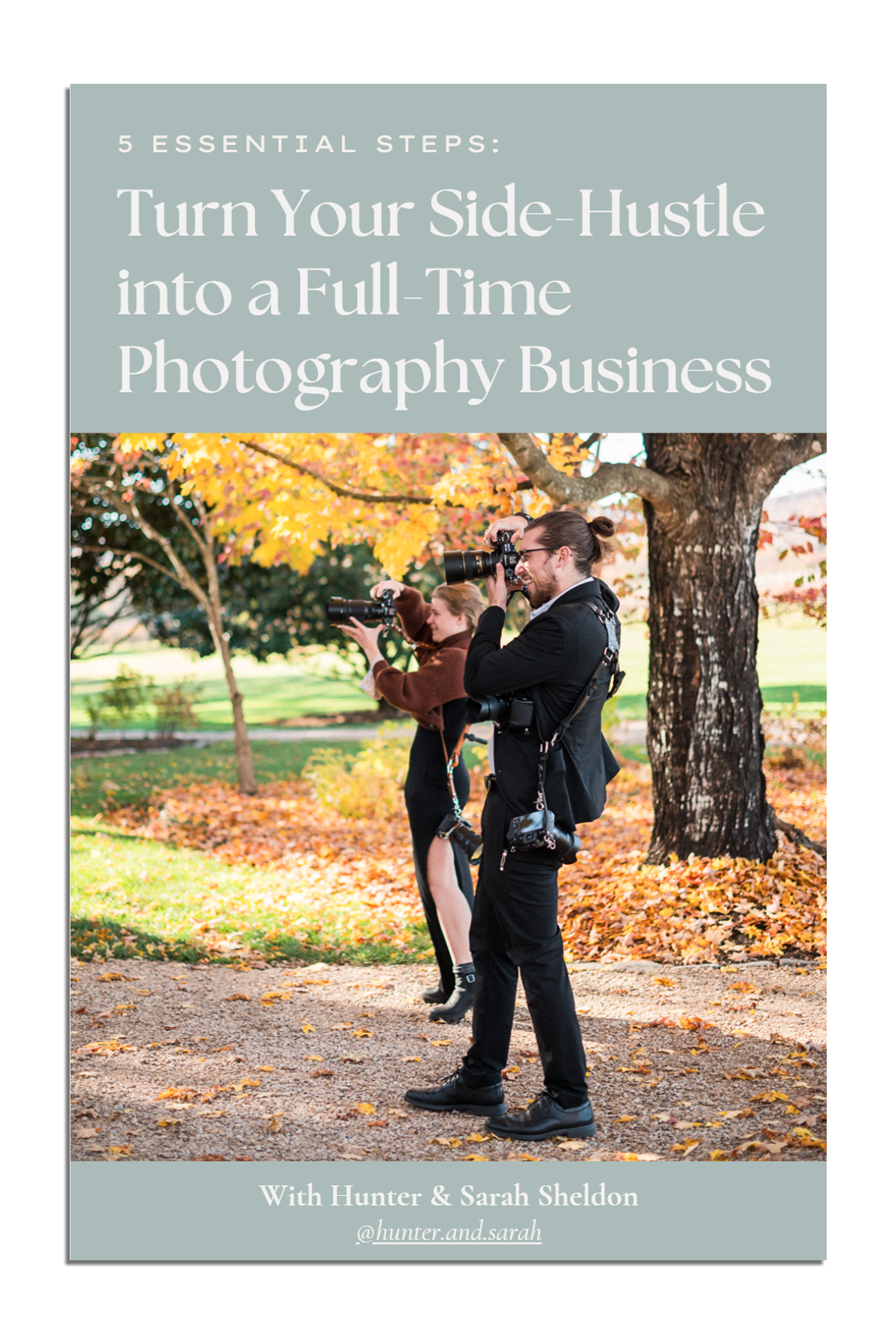
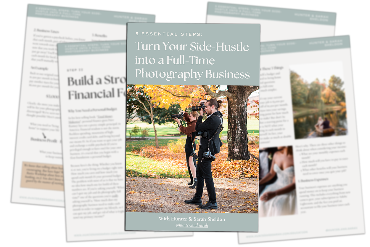
Click HERE to get your free copy of our eBook! “5 Essential Tips for Turning your Side-Hustle into a Full-Time Photography Business.” You’ll also be subscribed to our newsletter, so our newest content, weekly encouragement, and exclusive offers will be delivered right to your inbox!
Filed in:
Wedding Photography & Photography Education
Charlottesville, Virginia and Beyond
HOME
ABOUT US
WEDDINGS
JOURNAL
FOR PHOTOGRAPHERS
PRESS & PRAISE
BLOG
CONTACT
e. hunter@hunterandsarahphotography.com
p. (434) 260-0902
