VIEW BY CATEGORY:
Hi, we're Hunter and Sarah, a husband-and-wife, luxury wedding photography team. We’re also educators, helping other photographers build profitable and sustainable photography businesses.
MEET US
LOOKING FOR SOMETHING?
Increase Your Leads/Bookings with ONE Simple Photography Website Trick
July 20, 2023
Hey photographer friends! Welcome back to our Photography Blog, Mastering the Wedding Photography Biz with Hunter and Sarah! Today we’re going to discuss one simple trick that you can do to increase trust with visitors to your website. And since increased trust will almost definitely lead to increased leads, this simple change is a no-brainer, especially for newer wedding and portrait photographers!
Our Photography Website Trick: The First Thing Someone Sees…
When someone lands on your website, what’s the first thing that they should see? You might say that first they should see your very best image… but we don’t think that’s right. You might think that it’s your business’ name or logo… but we don’t think that’s it either. Maybe you’re guessing that it’s your pricing information or a list of services you provide… but again, we don’t think that’s the first thing that your website visitors should see.
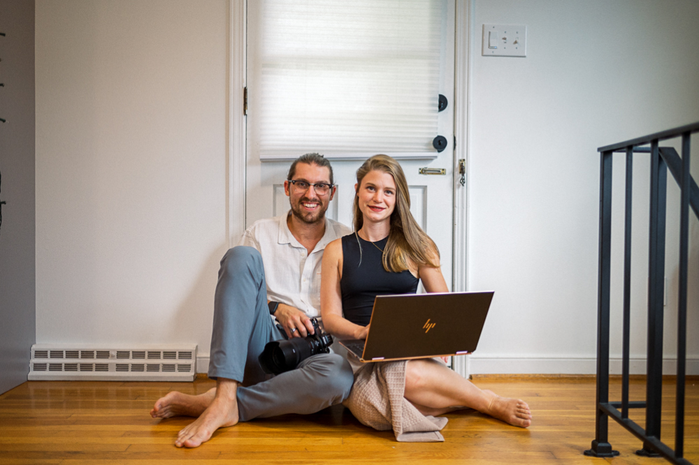
We think that the first thing that someone should see once they enter into your website… is you! After all, the thing that makes the biggest difference between your photography business and every other photography business you’re competing against isn’t your camera gear, your photography style, or how you edit your photos. It’s you!
And if you’ve been watching our videos or attending our workshops for very long, this shouldn’t be a surprise to you. We say all the time that you are the biggest difference in your photography business. And if you’ve seen our Photography Business Basics Workshop, then you know that’s why we believe that 95% of wedding and portrait photographers will be best served by naming their own photography businesses after themselves.
That’s why, when you go to our website, once you enter our homepage and scroll beyond the header, the very first thing you see is a picture of us! However, not every photo of you is created equal. So let’s chat about best practices for the image of you that should open up your photography website.
Best Practices for Your Website “Self Portrait”
When it comes to the very first photo that you put of yourself on your website, we think there are a few things that are important about this photo. Of course it should be professional and match the quality of images on the rest of your website. You’re a photographer after all! But there’s more to it than that. Even if this sounds a bit… unexciting, we think that the first photo of you should:
-
- Show you looking at the camera.
- Show a headshot or waist-up photo.
- Show yourself smiling.
- Show yourself holding your camera.
Let’s break down why we recommend each of those things! For starters, the most important part of this photography website trick is that you should be looking at the camera. In other words, your potential clients should be able to make “eye contact” with you when they look at your photo. That’s because humans convey their emotions through eye contact, so if someone can see your eyes, they’re more likely to trust you!
Science Backs Us Up!
And we’re not just speculating. There was a peer-reviewed study published in an academic journal (the Institute of Electrical and Electronics Engineers) that experimented with AirBnB listings. In one listing, guests could see a profile picture of the host looking at the camera. In the other, they saw the same AirBnB listing but couldn’t see the hosts’ eyes.
After 300+ participants took place in the experiment, they found that the listing with eye contact in the profile picture led to higher bookings. In other words, people felt more comfortable trusting a total stranger online because they were able to see their eyes!
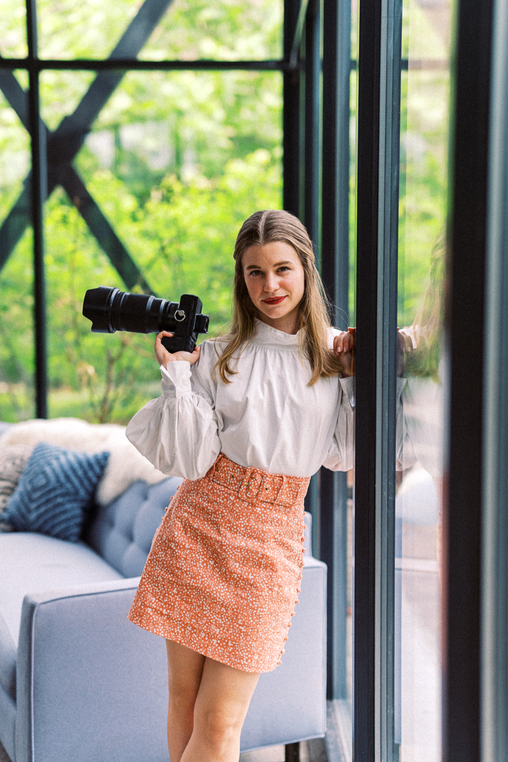
Here’s a little mini-experiment for you: which of these pictures of Sarah do you feel like you know better? Which one do you trust more? Maybe you’re biased because you’ve been watching our videos or reading our blogs for some time. But you can repeat this experiment by showing this to friends who have never heard of us, and I bet you’ll see that people really do trust people whose eyes they can see more.
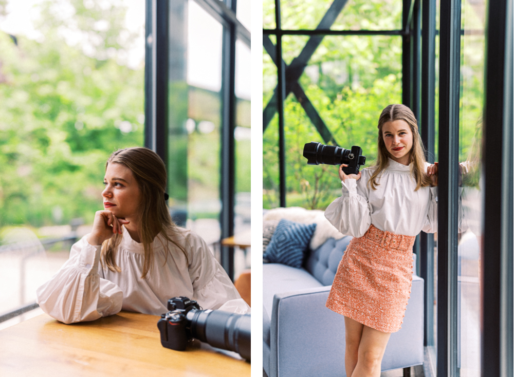
Although Sarah likes the image of herself on the left better, a stranger is more likely to trust her based on the image on the right!
Other Best Practices for Your Website “Self Portrait”
That leads right into the next best practice. The photo should be a headshot — or at the widest — a half-body shot. That’s because a full-body (and especially a wide landscape shot) makes your face so small, it’s going to be hard for people to see your face and relate to you!
I’m sure this has happened to you before: you get a friend/follow request on social media. But you don’t recognize the name! So what do you do? You go to check out their profile! But their profile picture is this super-wide shot of them in front of some scenic backdrop or something, and they’re absolutely tiny. What’s your first thought? “I have no idea who this person is…” That’s the opposite of communicating trust!
The third best practice is for you to be smiling. Even if you’re not the most smiley person in the world, smiling communicates friendliness and warmth. And to be honest, people want to work with people who seem nice! When we used to shoot professional headshot sessions, we’d have men and women alike tell us that they don’t want ANY smiling photos for their headshots. We’d gently recommend that they do a few with and without a smile. What happened? Without fail, they’d end up downloading both, or totally ignoring the stone-face images and just using the smiling one.

Make it SUPER Clear Who You Are!
Finally, we recommend that you be holding a camera in this first photo. This isn’t so you can flex on these clients and show them how big and professional your camera is. It’s so you can really clearly communicate, “Hey, the person whose site you’re visiting and who is going to take your photo… that’s me! I’m the photographer!”
We can’t tell you how many times we’ve done a website audit with one of our coaching students, and their first picture has been something really cool and artsy, with them walking through a field with their back to the camera or sipping coffee in a coffee shop. Is that a great picture of them that conveys personality? Absolutely! But if I’ve never been to your website before, I’m not sure if that’s you, or if that’s a picture that you took of one of your clients during a lifestyle session. And if I don’t know who you are, it’s harder for me to trust you.
And don’t get us wrong, we don’t think that every photo on your website needs to be like this! In fact, really just the first photo should. Every other photo can be as creative as you’d like, and the more it shows your personality, the better! But for this first photo, your goal is to show website visitors, “Hey, this is me! I’m the person who you might hire to take your photos. And I’m not a creep!”

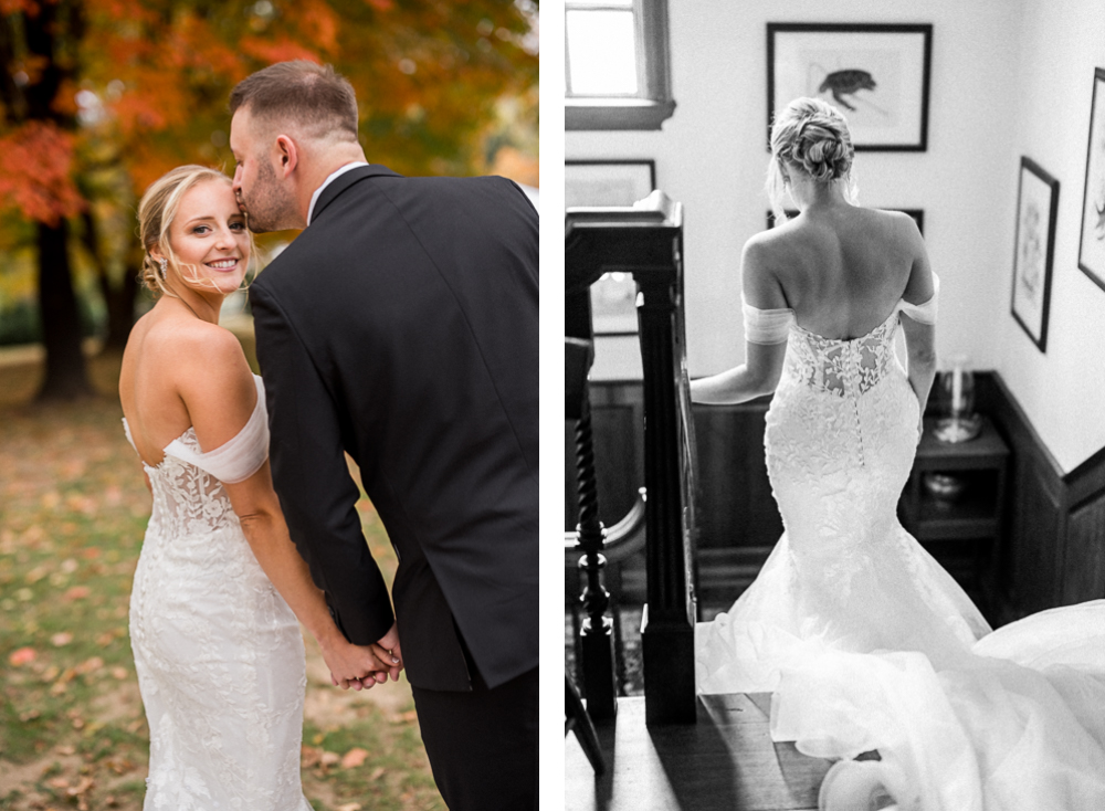
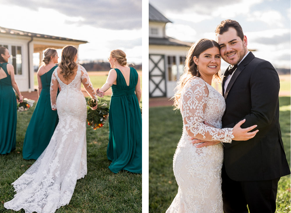
We LOVE these images of ourselves from our trip to Italy last summer. But if you landed on our website and saw these, you would have no clue if we had taken these photos of some random couple, or if this was us!
Want More Photography Website Tricks?
Now, if this one simple trick totally blew your mind, keep in mind that this is just one of dozens of updates that we often give our coaching students at the end of a website critique! And while a 2-on-1 website critique with us costs hundreds of dollars, and is only available to our recurring coaching students, if you think that your website could do a better job of converting visitors into leads, then you’re not alone.
Your website is sort of like your first impression with potential clients. And they’re going to decide in less than 5 minutes whether they’re going to inquire with you and give you a chance to sell to them… or exit out of your tab and forget that you exist. So if your website isn’t set up to take your website visitors on a pre-decided customer journey, and actually get them to take the actions that you want, then whatever marketing you’re doing might be wasted!
That’s why we’re hosting a workshop next week called “Website Essentials — How to Build a Simple Photography Website that Actually Gets You Leads”. Not only is this just a fraction of the cost of a two-on-one website critique with us, but we’re including SO much more than we could possibly cover in just a one hour coaching call.

This two-hour workshop is going to cover everything from the most basic and foundational reason why you even have a website in the first place, to how to set up a customer journey, no matter what template you use or what platform your website is on. We’re going to talk about how your website may grow over time, but which pages are essential to every photographer. We’re also going to discuss all the visuals that make a photography website thrive, and then hit on ALL the common mistakes that we see week in and week out in the websites of our students.
This LIVE workshop will be hosted on Tuesday, July 25th from 7-9 PM, and tickets are for sale RIGHT NOW for half-off before the workshop itself. Then, after that date, the replay will be available for purchase on our website.
If your website isn’t consistently converting visitors into hot leads that are inquiring directly into your inbox, then it might be time to invest in making your website better. And either way, we’ll see you next week with more photography business content!
Want More?
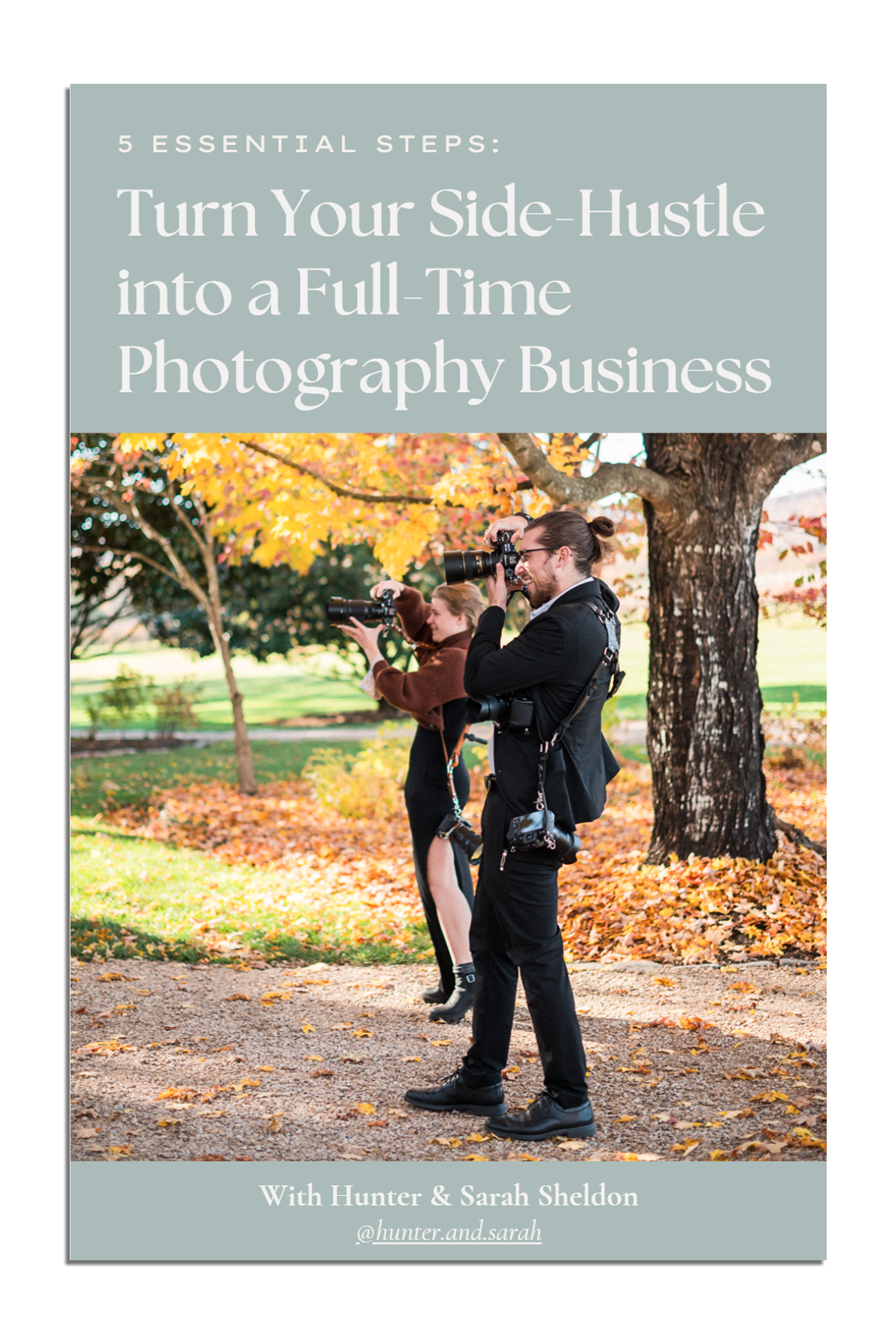
Click HERE to get your free copy of our eBook: “5 Essential Tips for Turning your Side-Hustle into a Full-Time Photography Business.” You’ll also be subscribed to our newsletter, so our newest content, weekly encouragement, and exclusive offers will be delivered right to your inbox!

Filed in:
Wedding Photography & Photography Education
Charlottesville, Virginia and Beyond
HOME
ABOUT US
WEDDINGS
JOURNAL
FOR PHOTOGRAPHERS
PRESS & PRAISE
BLOG
CONTACT
e. hunter@hunterandsarahphotography.com
p. (434) 260-0902
